Social Action: Final Image

Untitled-1 new

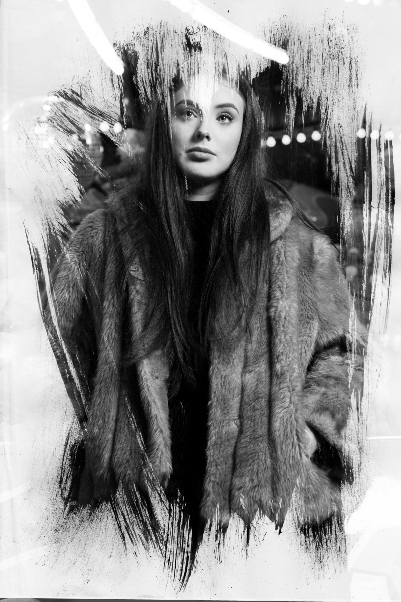
Pictured above is the image that I am using as my final image for this project. I am really happy with this outcome as I feel it represents my theme and my concept of battling the social standards of men and women well. I wanted to create something that brought men and women together as equals and showed that there is no difference between a man wearing makeup and a woman wearing makeup. By combining two portraits together it portrays the idea that they are the same person which is exactly what I was aiming to do.

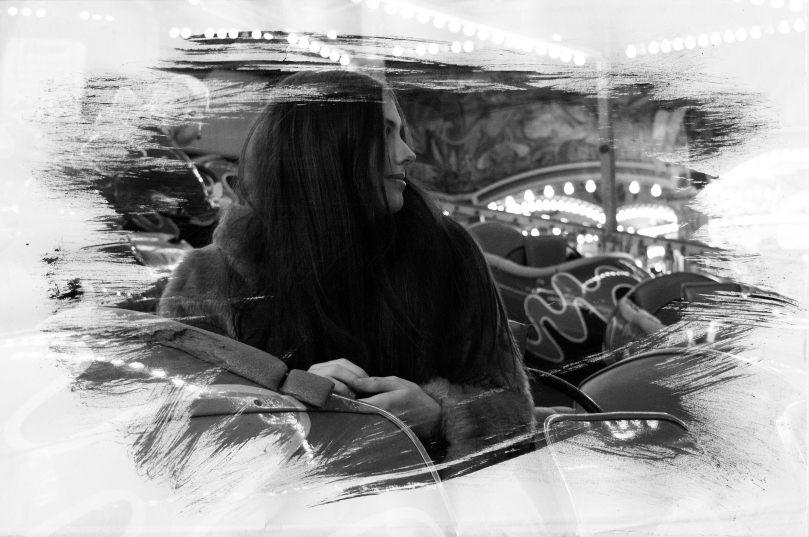
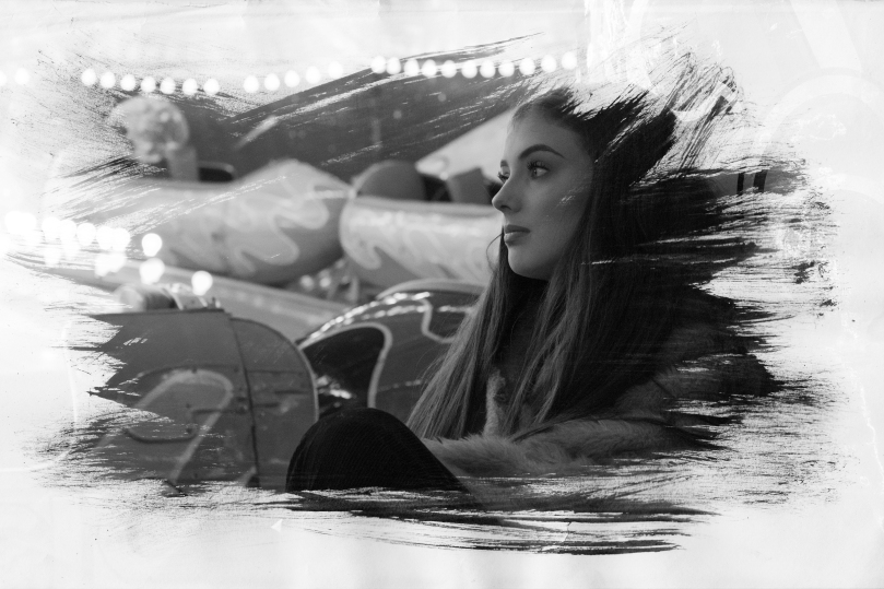
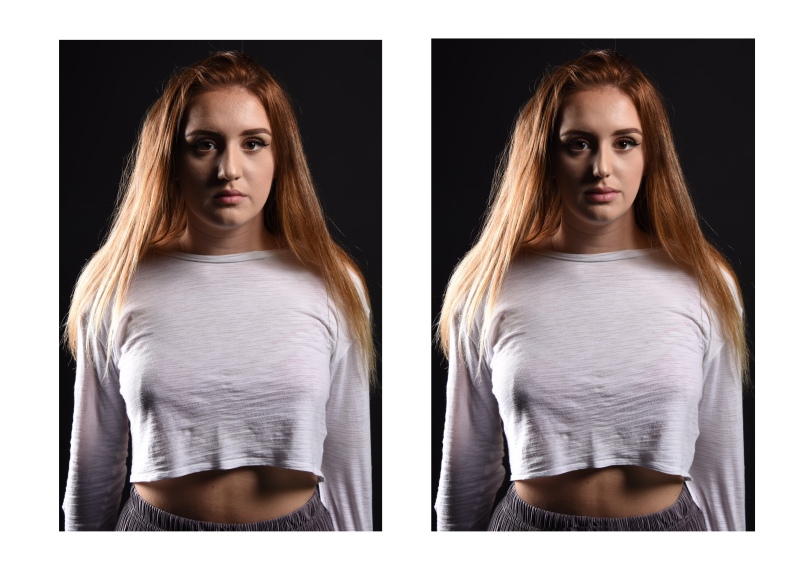
To create the image I got two portraits that I took during this project that are pictured above. I opened them up in Photoshop and put them onto an A3 canvas. I lined them up so the eyes were at the same height but I came across the issue that the female subject’s eyes were a lot wider and the distance between her eye and eyebrow were greater than the male subject. To resolve this issue I manipulated the image by compressing it down and ‘squishing’ it slightly to make her eye the same kind of height as the male subject’s whilst at the same time reducing the distance between her eye and eyebrow. This worked perfectly and it meant that everything was lined up. I then put the image of the male subject on top of the female one and moved it to the right until the centre of their noses were fairly aligned. This was quite difficult as their noses are at difference angles so I cropped the ends of their noses out to make it easier. Now that their faces were together and lined up I still had three issues with the picture: there was a line going down the centre separating the two images, there was a clear skin tone difference, and their eyes were completely opposite colours which made a clearer difference between the two people. I wanted it to seem as though it could pass as one individual and so these were big problems.

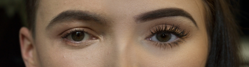
The first problem I tackled was the skin tone issue. I went onto the female image and using the selective colour tool I went into the ‘red tones’ and reduced the magenta slider, and increased the yellow and black slider. This levelled things out really well and created a good balance between the skin tones.

I then decided to resolve the issue of the separation line of the images. To do this I flattened the image, merging the two pictures together, and used the stamp tool to move down the nose to try and create a seamless blend between the images. This didn’t really work too well as it created more differences in the skin and the skin on the nose was a different shade to the one I was stamping on. I then decided to go back and instead of doing that I made a layer mask on the layer that was on top rather than merging the images by flattening, I erased using a very low opacity to reveal the layer underneath subtly. This created a beautiful blend which is pictured at the top and I think this worked really effectively.

To address the issue of the eye colours, I tried using the paint tool to darken the blue eye but it didn’t create a perfect shade. So what I did to correct this was select the male’s eye and copy it and paste it on top of the female’s eye. I changed the layer blend mode to ‘colour’ and this seemed to work perfectly as it made the eye colours almost the exact same.

Overall, I’m really impressed with how this turned out as it relates strongly to the theme of gender nonconformity and the  social standards of men and women that I wanted it to. The only thing I would improve about it if I could would be to make the nose straighter so it was a more seamless blend. Despite this, I’m still really happy with this outcome.

Male Makeup Photoshoot

This slideshow requires JavaScript.

This week I did a photoshoot with my boyfriend where I put makeup on him. I did this as a way of beginning my final images as I am going to use one of these pictures combined with another to create a comparison of a girl wearing makeup and a boy wearing makeup to show how there is no difference. I think this shoot turned out quite well as the natural lighting I used from the window lit up his face quite nicely. I am also going to be conducting an interview with Sean where I ask him about what it is like wearing makeup and what his opinions are on men wearing makeup and beauty products.

When taking these images I thought a lot about the work of Mihaela Noroc and how she takes her images in landscape to capture more about the life of the subject as well as the use of shallow depth of field to create a stronger focus point. I believe that I succeeded in using this technique to present a similar result.

If I could do something differently in the future I would have taken more pictures during the shoot so that I had more images I could work with. However, I am happy with the outcome and think they will work will for what I have planned for my final outcome.

Environmental Week: Final Image

l
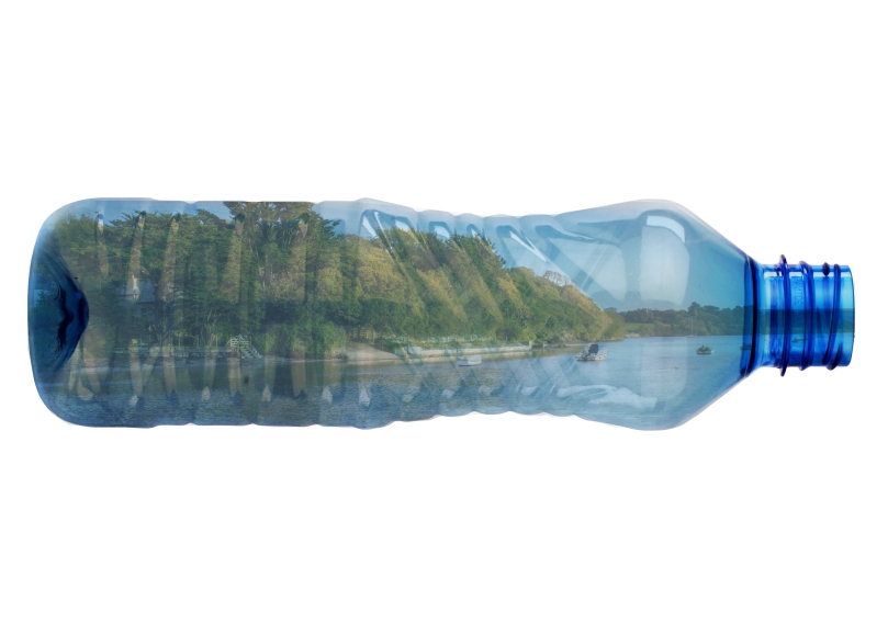
This is my final image for the environmental weekly brief. Going against my original plans, I decided to scrap the idea of a collage after failed attempts and decided to create something in Photoshop. My initial idea was to edit images of bottles into the ocean to create an ocean of bottles but it looked rather amateur and I gave up. However, I took a look at my work to see what I could do to improve it and thought, what if I put the ocean in the bottle instead? So I used the landscape image I took at Bowcombe bridge a couple months ago and found a picture of a clear bottle online and produced this outcome. I think it creates a pretty strong concept of how we live in a plastic world now. I was also inspired by the ships inside bottles you can get as that made me think about how I could put the ocean inside a bottle.

In terms of my failed collage, I tried to stick together small pictures of bottles onto the ocean at home but it got really messy very fast and it looked like a mess and so I scrapped it. I wish I had uploaded a picture of it but by the time I had realised that I should it was already thrown away. I then decided to create the same effect but in Photoshop and edited the same plastic bottle in the image above dozens of times over and over again until the entire ocean was covered. This looked even worse! That’s what got me thinking of how I could improve and brought me on to the idea of the ocean in the bottle.

To create this image was quite simple, I got the image of the bottle and rotated it so it was on its side. I then put the image of the landscape on top and lined it up so the water line was roughly in the middle. I cut out the parts of the landscape that were outside of the bottle using the polygonal lasso tool and inverse selecting once it was done. I changed the blend mode of the landscape to ‘multiply’ and the opacity to 58%. This left with the impression that the landscape was inside the bottle.

Overall, I am fairly happy with this image as it has a strong concept of us living in a world of plastic and I think it has been presented well. The only thing I wish I could have done to improve it would be to have created some kind of successful physical manipulation as I think it would have pushed my creativity a lot more which was one of my targets for this project. However, for the bigger Social Action brief I still have time to experiment and we’ll see what happens.

Advertising & Subvertising Week: Final Image

Subvert.jpg
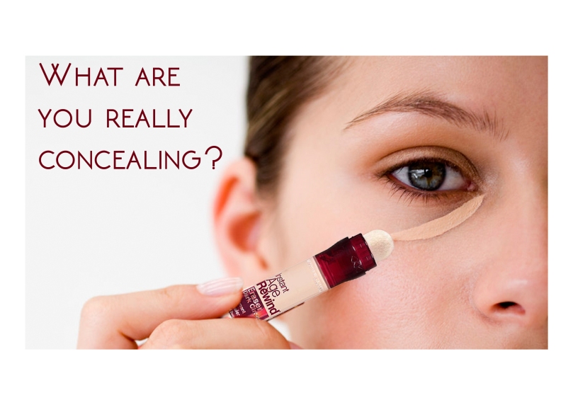
This is my final outcome for the advertising & subvertising weekly brief. I wanted to create something to do with the beauty industry and at first my initial idea was to do something with the Maybelline slogal ‘Maybe she’s born with it, maybe it’s Maybelline’, but I felt like this was overdone and I struggled to create anything I was happy with in Photoshop. I then thought deeper about their individual products and I took a look at the Maybelline Age Rewind concealer and how it ‘erases dark circles’ and gives the user a more youthful look. I wanted to create something that made the viewer think about what is implied by this product. In my opinion, the ‘Age Rewind’ concealer suggests that having signs of age is unattractive and should be concealed. My poster shows that in using a product that wants to hide your age, you’re really hiding who you are, your experiences, everything you’ve been through, making yourself just another person with no signs of individuality. I chose the question ‘What are you really concealing?’ as it asks the user of the product whether they’re concealing their dark circles, or who they are. I think that this is a strong concept and gets people thinking about what makeup products are really doing to them.

To create the image, I got a picture of a woman applying concealer from Google Images as well as a picture of the Maybelline Age Rewind concealer. I then cut the concealer out using the ‘Colour Range’ select tool and pasted it onto the picture of the model. One problem I faced during this was that the colour range tool had deleted a part of the sponge applicator but to overcome this issue I got a picture of another top of a sponge applicator and pasted it onto the top of it. I don’t think it’s obvious that this has been too Photoshopped and so I am happy with the outcome. I then added text to the image using the text tool and made it the same colour as the concealer to create a link between the question and the product.

I think my final outcome is successful because it’s straight to the point and in asking a direct question it draws more attention from the viewer. Another thing I like about it is that it’s also open to interpretation. You can look at this question from a variety of ways but often draw a similar conclusion. In terms of technical skills, I like the simplicity of the image; there’s not too much going on and that keeps the viewer focused on the question. I made the colour of the text the same colour as the concealer bottle to create a subtle link between the product and the question. If there was one thing I would improve next time it would be to make the name of the product more obvious, as I’m not sure if the ‘Age Rewind’ part of the product is obvious or whether it comes off as just a concealer. Either way, I think that the concept is still brought across just maybe from a different point a view.

Scanography Workshop

Today we had a lecture on scanography and how we can use the scanner to create photographic prints. What we aimed to achieve today was to create a stencil using paint and then use that stencil to cut out an image on Photoshop. Here is the stencil that I created:

rak

I then uploaded this scan onto Photoshop by going into ‘File’ – ‘Import’ – ‘Image from device’ and selecting the scanner. I changed the resolution to 600dpi so that the brush stroked were really clear. I got a portrait picture that I had taken before and created a new white layer to put underneath it. I then copied and pasted the stencil onto a layer above the portrait and went into ‘Select’ – ‘Colour range’. Then, I selected the dark parts of the paint and increased the fuzziness slider to the maximum. I exited the colour range setting and inversed my selection so the background was selected. I then hid the stencil layer and went onto the layer that the portrait was on and deleted the background. The effect that I was left with is pictured below:

Lauren 3LaurenLauren2

Overall, I am really impressed with the way my images turned out as the brush strokes create a really beautiful and interesting effect. I also really like the images that I used and I think they work well with this effect. The only thing I would improve would be to not increase the fuzziness slider so far up because in doing so it selected parts of the paper that the stencil was on that didn’t have paint on and in doing so caused some of the background of the portrait to seep through. However, I am still really happy with my outcome and think I have a good result. I may even consider working with the scanners to create more interesting prints in the future. One of my targets for this term was to try and practice with some more multi-media in order to have a wider range of creative skills and I think that this workshop has pushed me one step further towards that goal.

Social/Politial Documentary Week

This week we were given a brief to create a small piece of work on the theme of social/political documentary. We then had to present our work in an informal group critique session so that we could look at what everyone else had produced and get some feedback.

My first initial thought was to do something on theme of the ethics of photography as I think that this is something that could create a lot of discussion. I found a portrait picture that I had taken last term and turned down the clarity in the Camera RAW stage of editing and created another layer which was the original image. I then used the layer mask tool to erase the top layer (original image) over the skin to create an airbrushed effect to the models skin. This was meant to appear over-done to achieve a stronger impact. I also used the liquify tool to alter the model’s physical appearance including her eyes, nose, mouth, face shape and body shape. This created a really strongly edited image to the point where the model looks completely different and as some people during the critique said ‘scary’. This is what I created:

l.jpg

I have included a before image as well as I think that if it wasn’t there it could be difficult to determine what had been changed about her appearance. I think it was important to show this in order to show how people have become used to seeing overly Photoshopped images and thinking of them as real. This created a fair amount of discussion during the group critique as to when does Photoshopping go to far and I got quite a lot of positive feedback on my concept as no one else in the group had created anything along this theme.

Overall, I am quite happy with the way that this turned out as I think it has a strong concept. However, the only thing I would have changed would be to go even more over the top with the editing to make the difference between the original image and the edited image even stronger.

Design-To-Sell Event

This is what the final product for my design-to-sell brief turned out like. I bought three calendars for £15 each from the Boots website which was more expensive than I would have liked but they provided the best quality and the fastest delivery. Unfortunately, none of my calendars sold at the event but it was a really good experience to see what consumers were looking for in a calendar and how to price things. I aimed to sell them for £17 in order to make some profit but I realised that they weren’t going to sell for that much too late. However, I think they look really good and I’m really proud of my outcome.

Design-to-Sell and Commercial Enterprise Final Images

This slideshow requires JavaScript.

Pictured above are my 12 final images that I sent off to Coast & Country Cottages to use for advertising. Overall, I think they turned out really well as there are a wide variety of locations as well as different tones amongst them so they have a lot of choice. My only wish is that I had taken even more pictured and took more care when controlling the camera settings to make sure that everything was perfect at the time of shooting.

Bowcombe to Slapton Photoshoot

This slideshow requires JavaScript.

Recently, I travelled between Kingsbridge and Slapton taking pictures of the local villages along the way. This included Bowcombe bridge, Frogmore and Torcross. I thought this would be a good journey because I would be able to get a variety of images for both of my briefs and I was right. Pictured above are the before and after of five images that I thought were the best out of the whole shoot. I think they turned out really successful and I am happy with the way they are edited too. All that I have done to them is increase the highlights and decrease the shadows and then alter the colour balance. All of this was done in the Camera RAW stage of Photoshop and then I took some of the images directly into Photoshop and created a light vignette effect. I think this improved the overall quality of the images dramatically and I am really happy with them.

Dartmouth Photoshoot

This slideshow requires JavaScript.

Today I went to Dartmouth to take some images of the area that I thought would be good to use in my calendar and to send to Coast & Country Cottages. The images pictured above are the two that I thought were the best out of the lot and I also included before and after images of them once they had been edited to show what I would be sending off to the company. Overall, the shoot was fairly successful as I got a couple images I could use. The only issue I had was with the weather as it was blue skies when we got there but after an hour or so it became really cloudy and it was difficult to get a good shot. I knew the Coast & Country wouldn’t want images of grey skies so I tried my hardest to capture the most blue parts of the sky and then use the settings in the Camera RAW stage of Photoshop to increase the blue tones in the white tones to make the sky appear bluer than it actually was. This proved to be quite successful and so overall I would say this was a successful shoot. For the image of all the shops along a narrow road, I had an issue with getting the lighting right and so the most successful image turned out quite dark. Luckily, I was shooting in RAW and so this made it really simple for me to turn down the shadows in Photoshop and increase the highlights. This created a good balance of light and the image turned out well.