A Letter To Someone Important

This week we had to create a letter to someone important regarding a topic that was important to us. I chose Michelle Lee, the editor of Allure magazine about the topic of men and makeup. Here is what I wrote:

‘Dear Michelle Lee,

Did you know that according to a survey conducted by designer secret sales website www.hushhush.com, 11% of men secretly wear makeup. I personally find this statistic quite surprising and upsetting. Knowing that 1 in 10 men feel the need to hide the fact that they want to express themselves through makeup, doesn’t it upset you too? I believe that as a society we should be pushing more to encourage men to feel comfortable being who they want to be and to not feel the need to hide it. The male suicide rate seems to be forever increasing and could this be due to the society we live in constantly encouraging men to conform to a standard of being ‘masculine’ and to behave in a certain way?

As a highly popular and diverse women’s beauty magazine, I feel that it is partly your responsibility to make men feel just as included and comfortable as women to express themselves through makeup and beauty products. Take a look at the positive influence James Charles as the first cover boy for CoverGirl had. There was such a strong impact across the internet that showed how men can be empowered through makeup and that they shouldn’t feel like it is something to be ashamed of. Including more inclusive articles as well as using more male models could be a really great start to create some change in the community.

I believe that the world has a long way to come in terms of abolishing gender stereotypes and conformity, but as a society we can work together to make the world an equal place.

Yours sincerely,

Rachel Elliott’

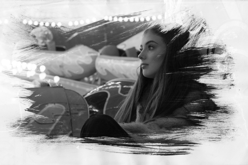
I think that it is really important to address the issues that men face with pressures to act and behave a certain way. I think that magazines and advertising agencies hold a huge responsibility to reduce this stress on men and that is why I think this letter to Michelle Lee is incredibly important.

Environmental Week: Final Image

l
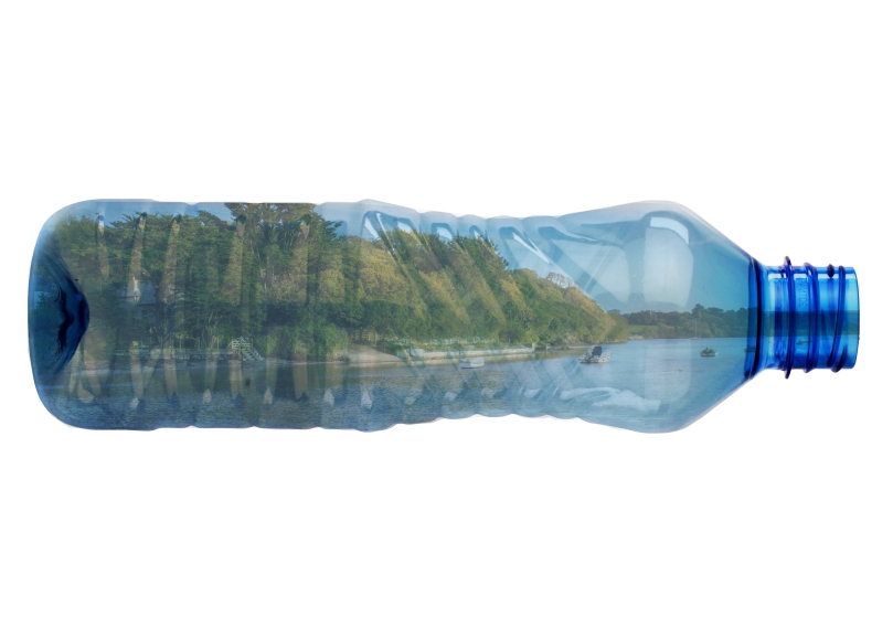
This is my final image for the environmental weekly brief. Going against my original plans, I decided to scrap the idea of a collage after failed attempts and decided to create something in Photoshop. My initial idea was to edit images of bottles into the ocean to create an ocean of bottles but it looked rather amateur and I gave up. However, I took a look at my work to see what I could do to improve it and thought, what if I put the ocean in the bottle instead? So I used the landscape image I took at Bowcombe bridge a couple months ago and found a picture of a clear bottle online and produced this outcome. I think it creates a pretty strong concept of how we live in a plastic world now. I was also inspired by the ships inside bottles you can get as that made me think about how I could put the ocean inside a bottle.

In terms of my failed collage, I tried to stick together small pictures of bottles onto the ocean at home but it got really messy very fast and it looked like a mess and so I scrapped it. I wish I had uploaded a picture of it but by the time I had realised that I should it was already thrown away. I then decided to create the same effect but in Photoshop and edited the same plastic bottle in the image above dozens of times over and over again until the entire ocean was covered. This looked even worse! That’s what got me thinking of how I could improve and brought me on to the idea of the ocean in the bottle.

To create this image was quite simple, I got the image of the bottle and rotated it so it was on its side. I then put the image of the landscape on top and lined it up so the water line was roughly in the middle. I cut out the parts of the landscape that were outside of the bottle using the polygonal lasso tool and inverse selecting once it was done. I changed the blend mode of the landscape to ‘multiply’ and the opacity to 58%. This left with the impression that the landscape was inside the bottle.

Overall, I am fairly happy with this image as it has a strong concept of us living in a world of plastic and I think it has been presented well. The only thing I wish I could have done to improve it would be to have created some kind of successful physical manipulation as I think it would have pushed my creativity a lot more which was one of my targets for this project. However, for the bigger Social Action brief I still have time to experiment and we’ll see what happens.

Scanography Workshop

Today we had a lecture on scanography and how we can use the scanner to create photographic prints. What we aimed to achieve today was to create a stencil using paint and then use that stencil to cut out an image on Photoshop. Here is the stencil that I created:

rak

I then uploaded this scan onto Photoshop by going into ‘File’ – ‘Import’ – ‘Image from device’ and selecting the scanner. I changed the resolution to 600dpi so that the brush stroked were really clear. I got a portrait picture that I had taken before and created a new white layer to put underneath it. I then copied and pasted the stencil onto a layer above the portrait and went into ‘Select’ – ‘Colour range’. Then, I selected the dark parts of the paint and increased the fuzziness slider to the maximum. I exited the colour range setting and inversed my selection so the background was selected. I then hid the stencil layer and went onto the layer that the portrait was on and deleted the background. The effect that I was left with is pictured below:

Lauren 3LaurenLauren2

Overall, I am really impressed with the way my images turned out as the brush strokes create a really beautiful and interesting effect. I also really like the images that I used and I think they work well with this effect. The only thing I would improve would be to not increase the fuzziness slider so far up because in doing so it selected parts of the paper that the stencil was on that didn’t have paint on and in doing so caused some of the background of the portrait to seep through. However, I am still really happy with my outcome and think I have a good result. I may even consider working with the scanners to create more interesting prints in the future. One of my targets for this term was to try and practice with some more multi-media in order to have a wider range of creative skills and I think that this workshop has pushed me one step further towards that goal.

Advertising & Subvertising Week

Screen Shot 2018-01-11 at 08.46.24.png

This week is advertising and subvertising week which means we have to create our own artistic response to this theme in an A3 poster format. I looked up different examples of subvertising and it is pictured above. We then need to present our work in an informal group critique session. For this theme I am actually quite stuck for ideas as this kind of comical approach to art and photography is very different to me and so I think I am going to have to do a bit more planning. My initial thought is to do it on makeup product photography and writing on top of what it is really saying, such as foundation saying ‘you need to cover your skin’ or concealer saying ‘your imperfections are flaws’. I may go a completely different route with it though.

What is an advert?

‘A notice or announcement in a public medium promoting a product, service or event or smoothing regarded as a means of recommending something.’

Early advertisements only used to focus on the product in hopes people would go out and purchase it.

Modern advertising is more about opinion and awareness. They show images alongside their products. Viewers then associate those images with that brand. People are then sold to the image and not that product.

What is a subvert?

A subvert is a spook or parody of corporate and political advertisements.

Subvert = To undermine power of authority.

A subvert may take the form of a new image or an alteration to an existing image or icon, often in a satirical manner.

Social/Politial Documentary Week

This week we were given a brief to create a small piece of work on the theme of social/political documentary. We then had to present our work in an informal group critique session so that we could look at what everyone else had produced and get some feedback.

My first initial thought was to do something on theme of the ethics of photography as I think that this is something that could create a lot of discussion. I found a portrait picture that I had taken last term and turned down the clarity in the Camera RAW stage of editing and created another layer which was the original image. I then used the layer mask tool to erase the top layer (original image) over the skin to create an airbrushed effect to the models skin. This was meant to appear over-done to achieve a stronger impact. I also used the liquify tool to alter the model’s physical appearance including her eyes, nose, mouth, face shape and body shape. This created a really strongly edited image to the point where the model looks completely different and as some people during the critique said ‘scary’. This is what I created:

l.jpg

I have included a before image as well as I think that if it wasn’t there it could be difficult to determine what had been changed about her appearance. I think it was important to show this in order to show how people have become used to seeing overly Photoshopped images and thinking of them as real. This created a fair amount of discussion during the group critique as to when does Photoshopping go to far and I got quite a lot of positive feedback on my concept as no one else in the group had created anything along this theme.

Overall, I am quite happy with the way that this turned out as I think it has a strong concept. However, the only thing I would have changed would be to go even more over the top with the editing to make the difference between the original image and the edited image even stronger.

Social Action – Units

UNIT 10 – CHARACTERISTICS AND CONTEXT IN ART AND DESIGN

  • Understand the characteristics and context for a chosen art and design activity.
  • Analyse the characteristics and context for a chosen art and design activity.
  • Use analysis to develop research activity.
  • Interpret research activity to develop ideas and creative proposals.

(Examine carefully the features and context of Social Action, develop research on this topic and then use research to develop ideas for a creative response.)

  • Be able to use knowledge of the characteristics and context of an art and design activity.
  • Use knowledge of the characteristics and context to plan and develop creative solutions for a chosen art and design activity.
  • Select appropriate materials to develop creative solutions for a chosen art and design activity.
  • Apply practical skills, knowledge and understanding of the characteristics and operational context to produce creative solutions for a chosen art and design activity.

(Plans and ideas for your creative response to Social Action. Use appropriate materials, practical skills and understanding to produce your final piece.)

  • Be able to use evaluation in support of art and design activity.
  • Critically evaluate creative solutions against identified characteristics and context for a chosen art and design activity.
  • Critically reflect on learning to inform personal development.

(Write an evaluation of your work indicating how it reflects the context of Social Action. Reflect on what you have learnt and how this will help with your personal goals.)

NEW BRIEF – Social Action

This week were given our new brief called ‘Social Action’.  I think this will be quite an interesting brief as it takes into account our personal opinions and feelings towards some strong and controversial topics. I believe that it will be really interesting to see what everyone produces and the different approaches that are taken. I have a few ideas in my head at the moment but I think I need to think about what I care about and how I can present that artistically.

One thing I have been trying to focus on improving since previous projects is my use of different forms of media besides photography. If I want to get my name out there and show that I have a wide range of talents I need to prove it by having a more ranged portfolio that shows multiple strengths. That’s why for this project I am going to try my hardest to do that.

Design-To-Sell – Change of Plans

I’ve decided that creating a cat calendar is too ambitious because looking at the amount of time I have left in the project, I don’t have enough time to get together images of cats for each of the months and edit them accordingly. I have decided that it would be better for me to use the images from my commercial enterprise brief and create a calendar using them. I think this would be a good idea because South Devon calendars are quite popular with locals who love where they live. I also think it will have a much wider audience than a calendar based on cats.

The Eagle Huntress – Film Review

The Eagle Huntress is a sports/adventure film about a 13 year old girl called Aisholpan defying the social standards of her Mongolian culture and participating in a tradition that had usually been passed on from son to son for generations. However, I feel as though this theme wasn’t strongly presented throughout the whole film.

For a film where the target audience is arguably young girls learning that they can fulfil their dreams, there aren’t many boundaries that Aisholpan has to overcome to prove that she can make a change in her community. At the end of the film, she becomes the ‘eagle huntress’ she wanted to be, but there is no evidence that it made any difference to how the men in the film viewed her. Throughout the film the never physically prevented her from participating in the eagle hunting but just seemed to frown upon it. I think for a film that suggests feminist themes there could be a stronger concept in order to have a larger impact on the audience. On the other hand, the narration was placed in well-timed sections of the film that kept reminding me that this was in fact a documentary and so the weaker concept couldn’t be resolved too much without causing the film to seem staged.

The cinematography was beautiful and consistent throughout with a varying use of drones, cameras, and go pros to fully tell Aisholpan’s story from a range of angles. However, despite the shots being stunning and breathtakingly composed, I feel as though there was some parts that were stretched out too much that took away from the story a little bit. I found myself getting tired of watching slow-motion eagle shots over and over again which made me begin to sense a bit of repetition.

Overall, I feel quite conflicted with my opinion on The Eagle Huntress. There were good intentions behind the creation of the film but I feel like the concept got lost part way through and the focus was taken away by the lengthy camera shots. I would give it an average rating as I feel a lot of my opinion is due to personal preference rather than the quality of the film.