Artist Talk: Peter Kennard

Peter Kennard is one of the most famous political artists in Britain. He describes his role in artistry as a ‘communicator’ and he believes that getting his work out in the open is just as important as the production of it. He has created imagery for posters, t-shirts and protest placards to support a variety of groups including CMD and Amnesty International.

I find Kennard’s work really interesting and thought provoking as he brings up some controversial topics including Tony Blair’s view on Iraq. I also agree with a lot of the stuff he creates which makes it even more appealing to me. He creates imagery in a way where you can’t disagree with it or argue that it’s untrue and he tells things the way the are but from a perspective people haven’t looked at it before. I think his work is extremely relevant to this weeks topic as well so it has definitely been beneficial to look at his work.

Advertising & Subvertising Week: Final Image

Subvert.jpgThis is my final outcome for the advertising & subvertising weekly brief. I wanted to create something to do with the beauty industry and at first my initial idea was to do something with the Maybelline slogal ‘Maybe she’s born with it, maybe it’s Maybelline’, but I felt like this was overdone and I struggled to create anything I was happy with in Photoshop. I then thought deeper about their individual products and I took a look at the Maybelline Age Rewind concealer and how it ‘erases dark circles’ and gives the user a more youthful look. I wanted to create something that made the viewer think about what is implied by this product. In my opinion, the ‘Age Rewind’ concealer suggests that having signs of age is unattractive and should be concealed. My poster shows that in using a product that wants to hide your age, you’re really hiding who you are, your experiences, everything you’ve been through, making yourself just another person with no signs of individuality. I chose the question ‘What are you really concealing?’ as it asks the user of the product whether they’re concealing their dark circles, or who they are. I think that this is a strong concept and gets people thinking about what makeup products are really doing to them.

To create the image, I got a picture of a woman applying concealer from Google Images as well as a picture of the Maybelline Age Rewind concealer. I then cut the concealer out using the ‘Colour Range’ select tool and pasted it onto the picture of the model. One problem I faced during this was that the colour range tool had deleted a part of the sponge applicator but to overcome this issue I got a picture of another top of a sponge applicator and pasted it onto the top of it. I don’t think it’s obvious that this has been too Photoshopped and so I am happy with the outcome. I then added text to the image using the text tool and made it the same colour as the concealer to create a link between the question and the product.

I think my final outcome is successful because it’s straight to the point and in asking a direct question it draws more attention from the viewer. Another thing I like about it is that it’s also open to interpretation. You can look at this question from a variety of ways but often draw a similar conclusion. In terms of technical skills, I like the simplicity of the image; there’s not too much going on and that keeps the viewer focused on the question. I made the colour of the text the same colour as the concealer bottle to create a subtle link between the product and the question. If there was one thing I would improve next time it would be to make the name of the product more obvious, as I’m not sure if the ‘Age Rewind’ part of the product is obvious or whether it comes off as just a concealer. Either way, I think that the concept is still brought across just maybe from a different point a view.

Subvertising – Beauty Research

Today I was looking at subvertising aimed more towards the makeup & beauty industry as that is what I am basing my outcome of this week on. One thing that was good and bad about my research was that there aren’t many examples of subvertising of this category. This gives me a lot more creative freedom to do something that hasn’t already been done. I am definitely thinking about focusing on individual products and putting a sarcastic or ironic slogan underneath it. I think these examples that I have found of Maybelline and the Justin Bieber perfume are really good starting points as they bring up some really important points. I love the way how in the Maybelline subvert they bring up Photoshop and how in the picture the model has been edited a lot and it doesn’t show the power of the makeup but the power of editing. This relates to what I did last week and kind of has a similar theme. In the Justin Bieber subvert they somewhat poke fun at the kind of people that purchase products by celebrities which is something I find really funny and interesting. It’s definitely a good topic to bring up and although I don’t think I am going to focus on celebrities in my final outcome it gives me a good idea of how I can make a subvert about the beauty industry more comical.

Scanography Workshop

Today we had a lecture on scanography and how we can use the scanner to create photographic prints. What we aimed to achieve today was to create a stencil using paint and then use that stencil to cut out an image on Photoshop. Here is the stencil that I created:

rak

I then uploaded this scan onto Photoshop by going into ‘File’ – ‘Import’ – ‘Image from device’ and selecting the scanner. I changed the resolution to 600dpi so that the brush stroked were really clear. I got a portrait picture that I had taken before and created a new white layer to put underneath it. I then copied and pasted the stencil onto a layer above the portrait and went into ‘Select’ – ‘Colour range’. Then, I selected the dark parts of the paint and increased the fuzziness slider to the maximum. I exited the colour range setting and inversed my selection so the background was selected. I then hid the stencil layer and went onto the layer that the portrait was on and deleted the background. The effect that I was left with is pictured below:

Lauren 3LaurenLauren2

Overall, I am really impressed with the way my images turned out as the brush strokes create a really beautiful and interesting effect. I also really like the images that I used and I think they work well with this effect. The only thing I would improve would be to not increase the fuzziness slider so far up because in doing so it selected parts of the paper that the stencil was on that didn’t have paint on and in doing so caused some of the background of the portrait to seep through. However, I am still really happy with my outcome and think I have a good result. I may even consider working with the scanners to create more interesting prints in the future. One of my targets for this term was to try and practice with some more multi-media in order to have a wider range of creative skills and I think that this workshop has pushed me one step further towards that goal.

What is Scanography?

Scanography is the process of capturing digitalised images of objects for the purpose of creating printable art using a flatbed scanner. There are a lot of different things that the scanner be used for to create a photographic print. Some of these include arranging 3D objects on top of the scanner to create a shallow depth of field as well as painting onto a piece of paper for the purpose of using it as a stencil in Photoshop to emulate the style of using liquid photographic emulsion.

Liquid photographic emulsion, also known as Liquid Light or Silver Gelatin, is a silver based sensitiser designed for applying on any surface, exposing with an enlarger and processing in conventional black & white chemistry. It is virtually the same emulsion as found on ordinary photographic paper, but in a liquid form and can be coated on a wide range of 2D and 3D surfaces. Here are some examples of using liquid emulsion:

I think that scanography is a really brilliant way to emulate this classic style more easily and experimenting with this style will be really interesting.

Advertising & Subvertising Week

Screen Shot 2018-01-11 at 08.46.24.png

This week is advertising and subvertising week which means we have to create our own artistic response to this theme in an A3 poster format. I looked up different examples of subvertising and it is pictured above. We then need to present our work in an informal group critique session. For this theme I am actually quite stuck for ideas as this kind of comical approach to art and photography is very different to me and so I think I am going to have to do a bit more planning. My initial thought is to do it on makeup product photography and writing on top of what it is really saying, such as foundation saying ‘you need to cover your skin’ or concealer saying ‘your imperfections are flaws’. I may go a completely different route with it though.

What is an advert?

‘A notice or announcement in a public medium promoting a product, service or event or smoothing regarded as a means of recommending something.’

Early advertisements only used to focus on the product in hopes people would go out and purchase it.

Modern advertising is more about opinion and awareness. They show images alongside their products. Viewers then associate those images with that brand. People are then sold to the image and not that product.

What is a subvert?

A subvert is a spook or parody of corporate and political advertisements.

Subvert = To undermine power of authority.

A subvert may take the form of a new image or an alteration to an existing image or icon, often in a satirical manner.

Steve McCurry – Afghan Girl

174_1_prints_multiples_january_2017_steve_mccurry_afghan_girl__wright_auction

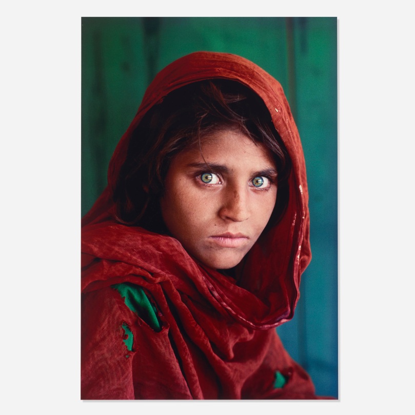
What is the story behind this image?

Steve McCurry is an American photographer who has worked in photojournalism and one day during his trip to Pakistan he stumbled upon this girl amongst a sea of tents in a refugee camp. He took her picture not expecting it to be as impactful as it has become and it made it on to the cover of National Geographic in 1985 as viewers felt as though the girls’ eyes had such a haunting effect which gave an insight into the emotional pain that war can cause.

The photograph is considered one of the most recognised images ever to be published in the National Geographic, what are your own thoughts on the image?

I think that this picture is incredibly powerful as well as technically brilliant. The vibrant colour of the girl’s eyes are immediately captivating and create an extremely strong focus point. The emotion behind the image is felt effortlessly as her emotions are expressed solely through her eyes. In terms of technical success, the way the colours work together so well creates such an appealing image as the background and the accents of her clothes work perfectly with her eyes and push the focus point even more to her eyes making you feel as though you can’t look away as well as the red tones creating a strong contrast. Therefore, I think this is very successful image and the story behind it is told effortlessly.

Why were the photographer and the girl re-united 17 years after the photograph was taken?

A team from National Geographic Television & Film’s EXPLORER brought McCurry to Pakistan to search for the girl. They originally took the photograph to the refugee camp where the photo had been taken 17 years before and had little success. However, a man who had heard about the search informed them that he had lived in the camp with the girl and that her name was Sharbat Gula and she lived in the mountains near Tora Bora. When they were reunited McCurry immediately recognised her.

Why did the Afghan girl make national headlines again in 2016 and what was Steve McCurry’s involvement?

The Afghan girl made headlines again in 2016 after she was welcomed back into Afghanistan by the president after she was deported from Pakistan. Gula was received warmly by President Ashraf Ghani, in line with his government’s policies to encourage Afghans to come back to their country, and he handed her the key to a government-provided apartment in Kabu.

Do you think the girl benefitted in any way from this photograph or the did the photograph provide any wider/positive social impact?

I think that Sharbat Gula did benefit from this photograph and that it also created a wider and more positive social impact as it made millions of people aware of what is going on in the world and how war impacts children. I think it made people think a lot more about how lucky they are to have what they have and pay more attention to things that are going on around them.
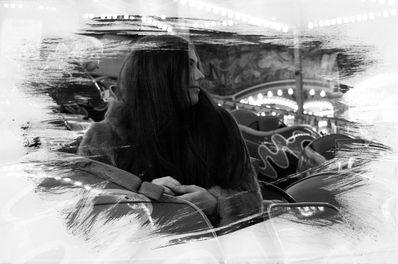
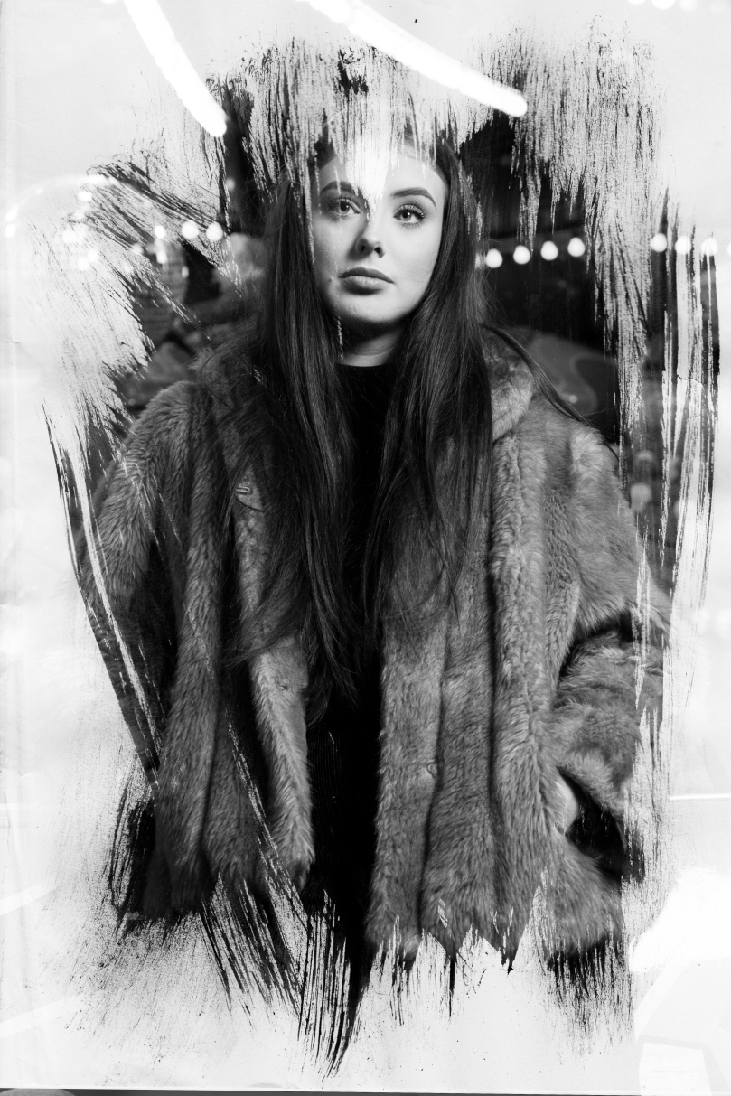
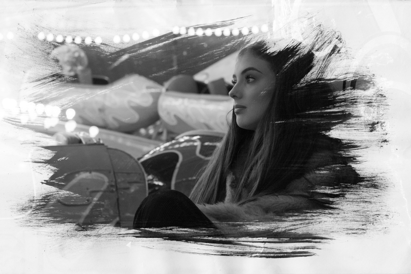
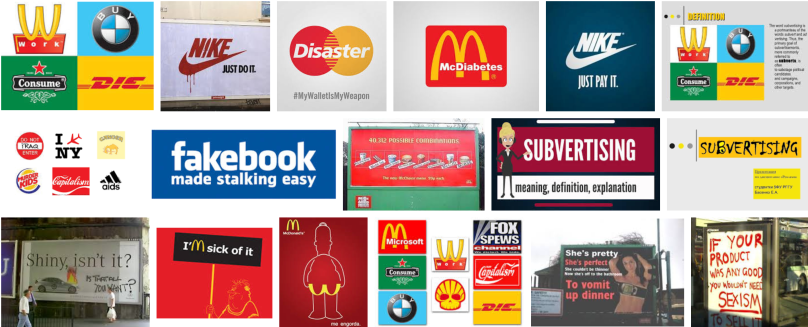
Social/Politial Documentary Week

This week we were given a brief to create a small piece of work on the theme of social/political documentary. We then had to present our work in an informal group critique session so that we could look at what everyone else had produced and get some feedback.

My first initial thought was to do something on theme of the ethics of photography as I think that this is something that could create a lot of discussion. I found a portrait picture that I had taken last term and turned down the clarity in the Camera RAW stage of editing and created another layer which was the original image. I then used the layer mask tool to erase the top layer (original image) over the skin to create an airbrushed effect to the models skin. This was meant to appear over-done to achieve a stronger impact. I also used the liquify tool to alter the model’s physical appearance including her eyes, nose, mouth, face shape and body shape. This created a really strongly edited image to the point where the model looks completely different and as some people during the critique said ‘scary’. This is what I created:

l.jpg

I have included a before image as well as I think that if it wasn’t there it could be difficult to determine what had been changed about her appearance. I think it was important to show this in order to show how people have become used to seeing overly Photoshopped images and thinking of them as real. This created a fair amount of discussion during the group critique as to when does Photoshopping go to far and I got quite a lot of positive feedback on my concept as no one else in the group had created anything along this theme.

Overall, I am quite happy with the way that this turned out as I think it has a strong concept. However, the only thing I would have changed would be to go even more over the top with the editing to make the difference between the original image and the edited image even stronger.

Social Action – Units

UNIT 10 – CHARACTERISTICS AND CONTEXT IN ART AND DESIGN

  • Understand the characteristics and context for a chosen art and design activity.
  • Analyse the characteristics and context for a chosen art and design activity.
  • Use analysis to develop research activity.
  • Interpret research activity to develop ideas and creative proposals.

(Examine carefully the features and context of Social Action, develop research on this topic and then use research to develop ideas for a creative response.)

  • Be able to use knowledge of the characteristics and context of an art and design activity.
  • Use knowledge of the characteristics and context to plan and develop creative solutions for a chosen art and design activity.
  • Select appropriate materials to develop creative solutions for a chosen art and design activity.
  • Apply practical skills, knowledge and understanding of the characteristics and operational context to produce creative solutions for a chosen art and design activity.

(Plans and ideas for your creative response to Social Action. Use appropriate materials, practical skills and understanding to produce your final piece.)

  • Be able to use evaluation in support of art and design activity.
  • Critically evaluate creative solutions against identified characteristics and context for a chosen art and design activity.
  • Critically reflect on learning to inform personal development.

(Write an evaluation of your work indicating how it reflects the context of Social Action. Reflect on what you have learnt and how this will help with your personal goals.)

Social Action – Group Response

Today in response to our new Social Action brief we had to get into 3 groups and create a mind map on the themes of ‘People’, ‘Places’, and ‘Animals/Nature’. Here is what we created:

It was really interesting to see what other people’s first impressions were of the brief and they brought up some topics that I didn’t even consider. It made me think a lot more about what I’m going to do for my main project and gave me a lot of different ideas/